Usability: What does this button do?
In software development projects, paying proper attention to usability aspects, can greatly help ‘getting the message functionality across’. Usability is a field of expertise on its own and involves techniques like wireframes, prototyping and card sorting. Not every project is the same and (sadly) lack of time or budget can prevent specialized interaction designers to be involved in the project. This means that making the application ‘usable’ becomes the responsibility of graphic designers or developers (or it is neglected altogether). Not an easy combination of tasks…
When developing or visually designing an application one goes into much detail which makes it hard to step back and look at the application from an end user’s perspective. To help measure and improve usability there are numerous usability checklists out there, some of them focusing on specific subjects like forms. Such lists can be very complete (and thereby very long) and because of that difficult to continuously use during development. They tend to be more useful as an evaluation tool than as a development tool.
To help during development (or design) it helps to keep in mind that a user using an application is all about interaction and exchanging information. At any given moment while using an application, a user might wonder things like:
- What did that button do?
- What will this button do?
- What does this label mean?
- How can I find the page I’m looking for?
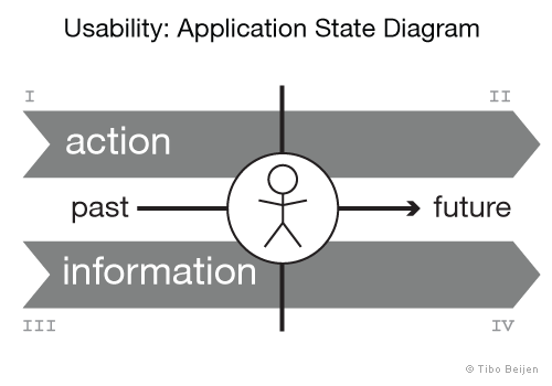
Summarized: action and information, past and future as illustrated below:

Usability: Application State Diagram
Four quadrants
I. Past actions
This translates to ‘feedback’. Is it at any point clear to the user what the application is doing or has done, following the user’s commands? Is the feedback form sent? Are modifications done through the CMS visible online? Is the application really still busy or is something going wrong?
II. Future actions
Feed forward. For a user to ‘trust’ an application he needs to be able to predict what will happen when he performs certain actions. Take for instance a webshop: After clicking ‘place order’, will there be a screen to review and possibly cancel the order process? Or, after saving a page in a CMS, will it be possible to preview a page before it’s visible on the live site?
III. Past information
This focuses mainly on how information is displayed at a given point. Is important information clearly recognizable? Is it clear what is displayed? For example a product page on a webshop: Can editorials and user comments be clearly distinguished?
IV. Future information
This covers navigation and thereby how all the information and possible interaction of an application is structured. To efficiently use an application a user needs to be able to predict where to find information and how to get there. This involves structuring navigation and perhaps also tailoring navigation to accommodate for common usage scenarios.
What this diagram does not
The above diagram focuses on the state of an application at a given point and therefore doesn’t look at the bigger picture. This means it doesn’t:
- Cover consistency throughout the application.
- Prioritize functionality.
- Match functionality with user goals.
- Look into characteristics of the targetted users (like experience with similar applications) or the environment the application is used in.
What this diagram can do
Taking back a step once in a while during development and applying this diagram on the application that is being created, can help to quickly point out certain usability flaws. This is especially true when there is no dedicated usability expert in the team. Having a certain amount of knowledge of the more elaborate checklists mentioned earlier will help. Besides being used as a quick evaluation tool this diagram can also be used to structure usability-related thoughts and ideas and predict their effectiveness. Hopefully that will help creating a better user experience.